Straß, Austria
JOEBSTL HQ
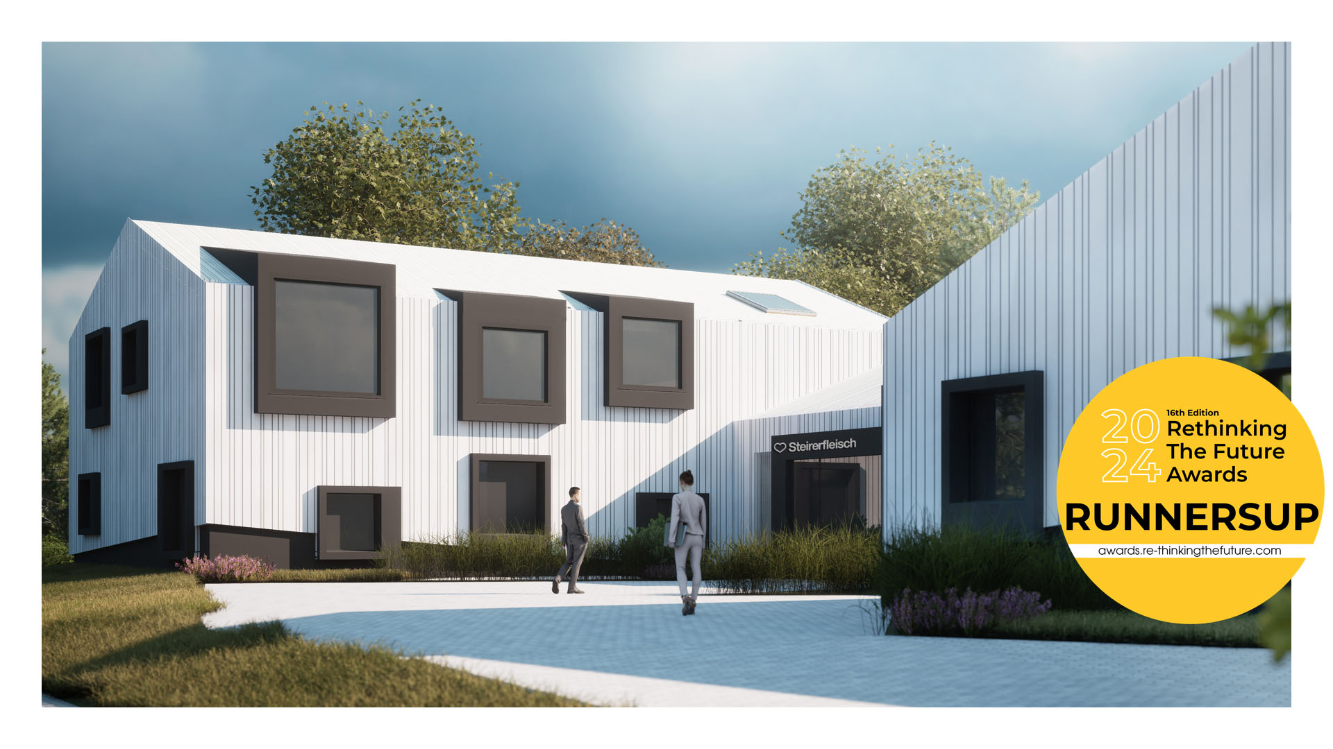

JOEBSTL HQ
The client came to us with an idea to extend and repurpose the existing buildings with goal of creating representative office spaces, multi-purpose areas as well as the new canteen for the workers of the factory. Improving the overall workspace quality for all of the workers was our guiding principle set by the client. The old factory complex has already been expanded and renovated numerous times throughout the years. Therefore, sadly, little of the initial factory character has remained untouched. During the project development, the functions have steadily expanded, the project grew and it was decided to scrape the idea and instead of repurposing to create a whole new separate building on site. Being “freed” from the constraints of the old building and rather small area to expand and fit everything, we took a fresh look at the site.
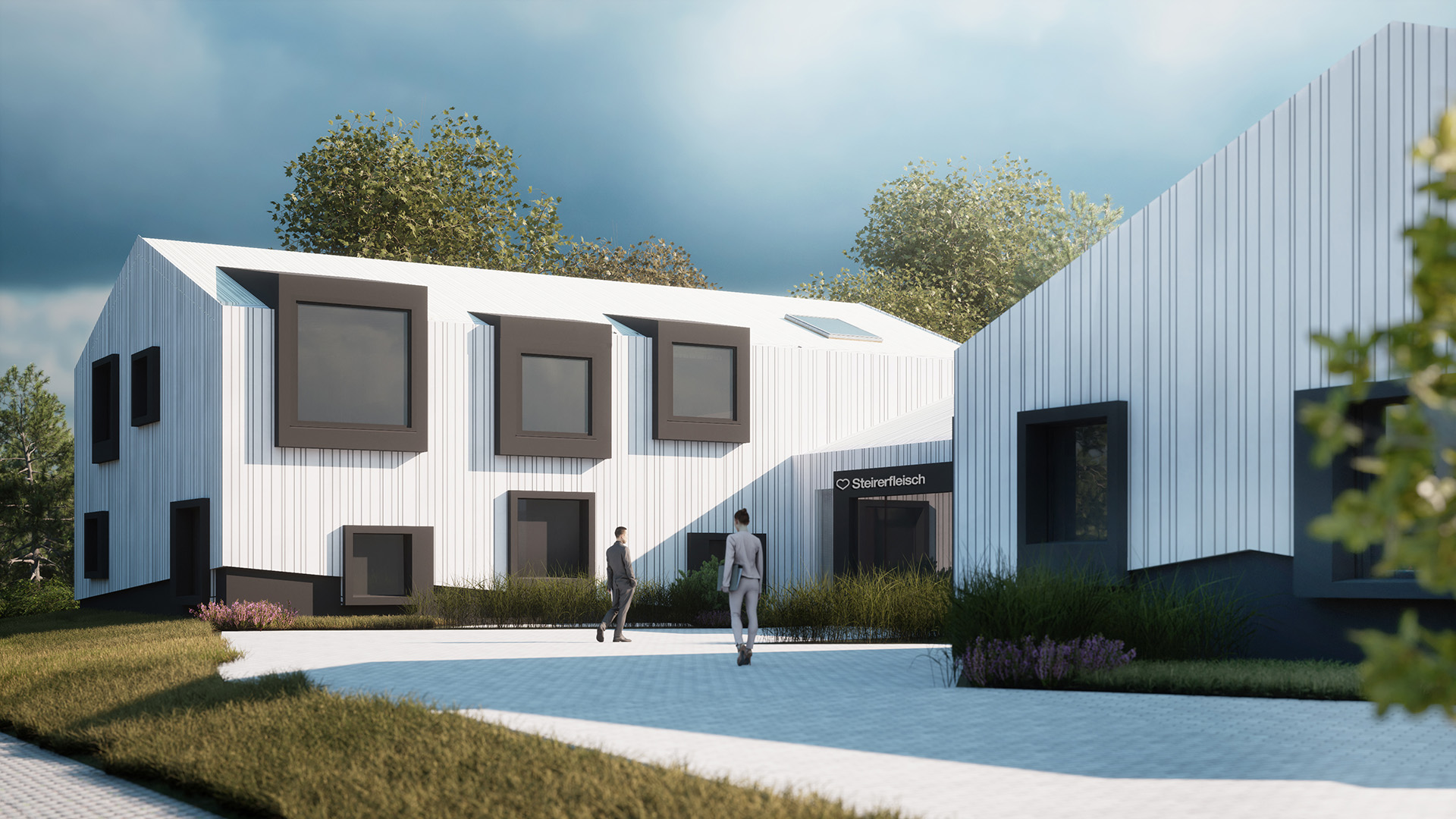
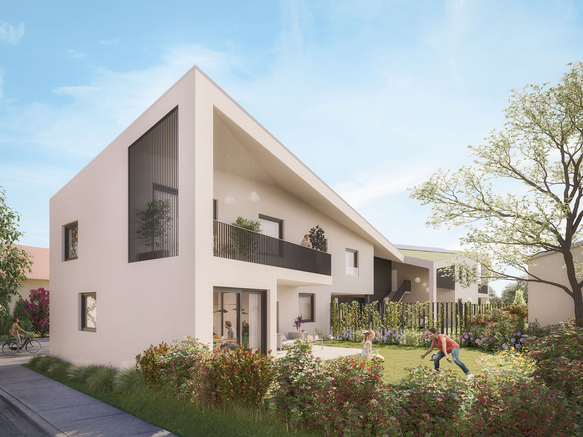
The site is located in the quite idyllic country-side in the South of Austria, surrounded by the rolling green hills. The most typical buildings one can encounter here are obviously the traditional single family houses and barns. Both of them characterized by the iconic pitched roof and shed-like form. This inspired us to take his form, and start playing with it to find the solution for our project.
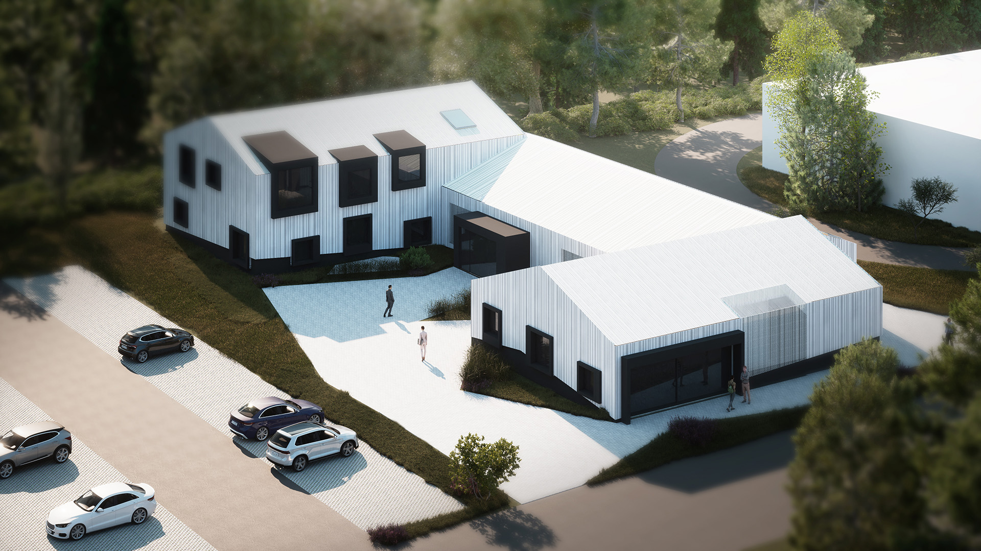
By scaling, stretching and rotating this basic form we came to a realization that an u-shaped building would be the perfect solution for out project.

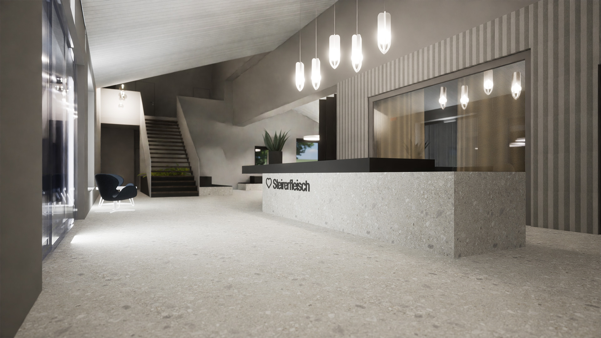
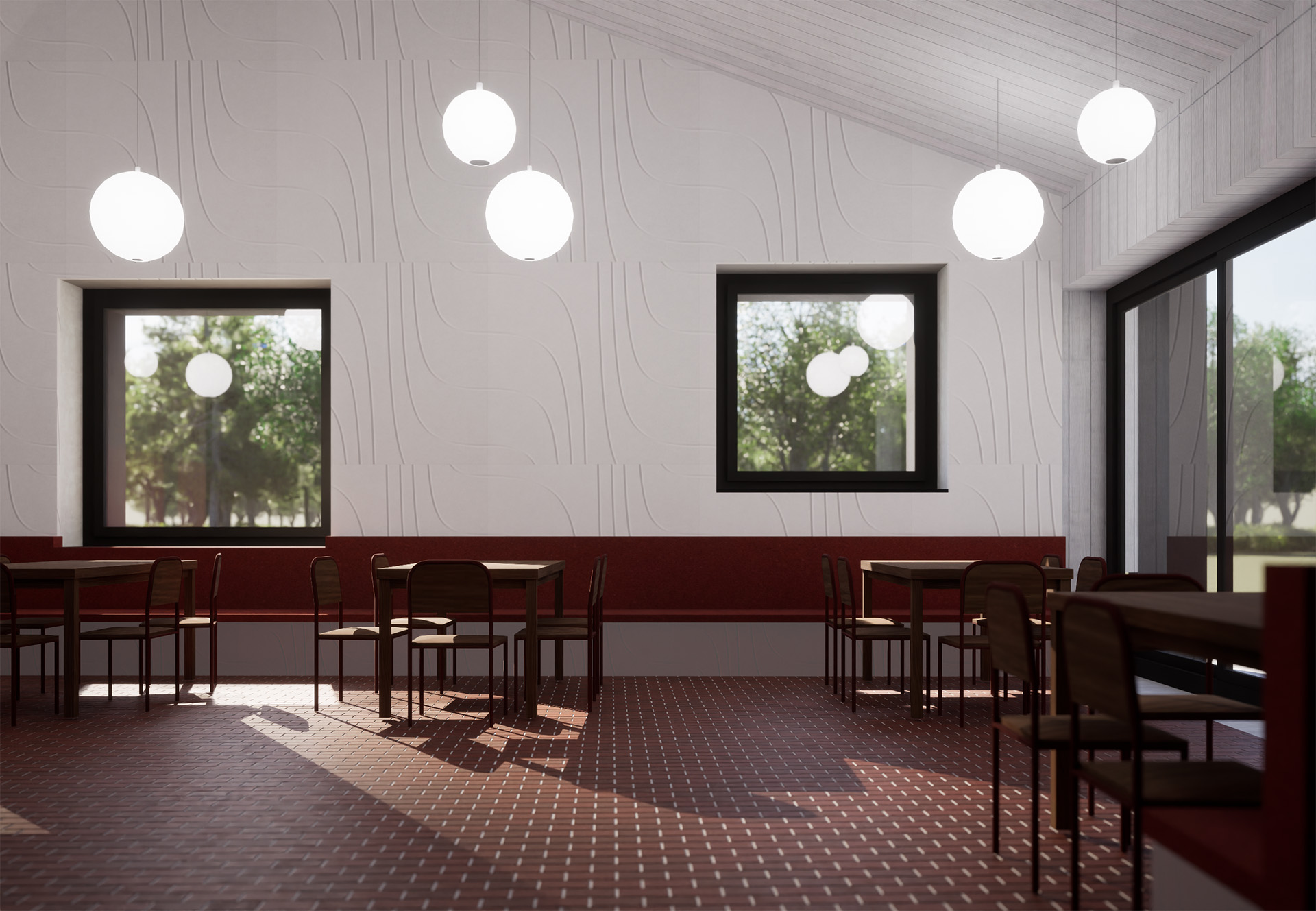
The building is orientated away from the factory, therefore, due to the U-shape, creating a separate, almost private space in front of it. The middle part of the building is the foyer, it is the heart of the building. It features the large meeting room, which can be opened up to the foyer to create a larger space for welcoming larger delegations. The right and left wing of the building each have a distinct purpose – while the right part is spread on two floors and purposed strictly for the offices, administration and all the bureaucratic functions which come with running a factory, the left wing is planned as a low and wide space for the canteen for both the office and factory workers. The canteen can be opened up from both sides of the building to create a open gathering space for the summer months for the workers.
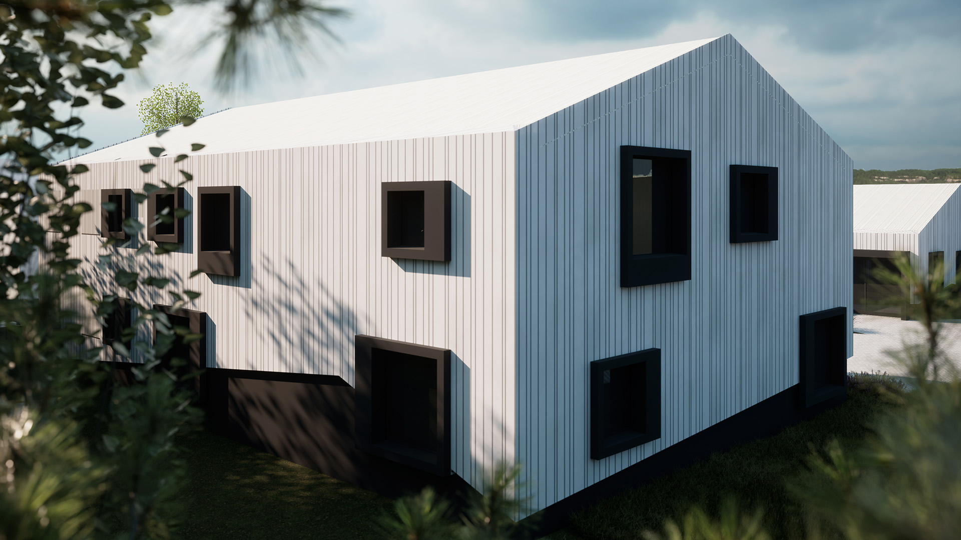
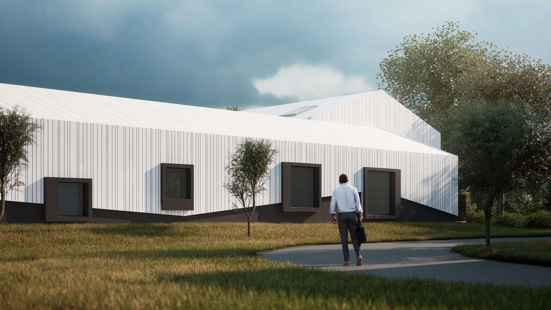
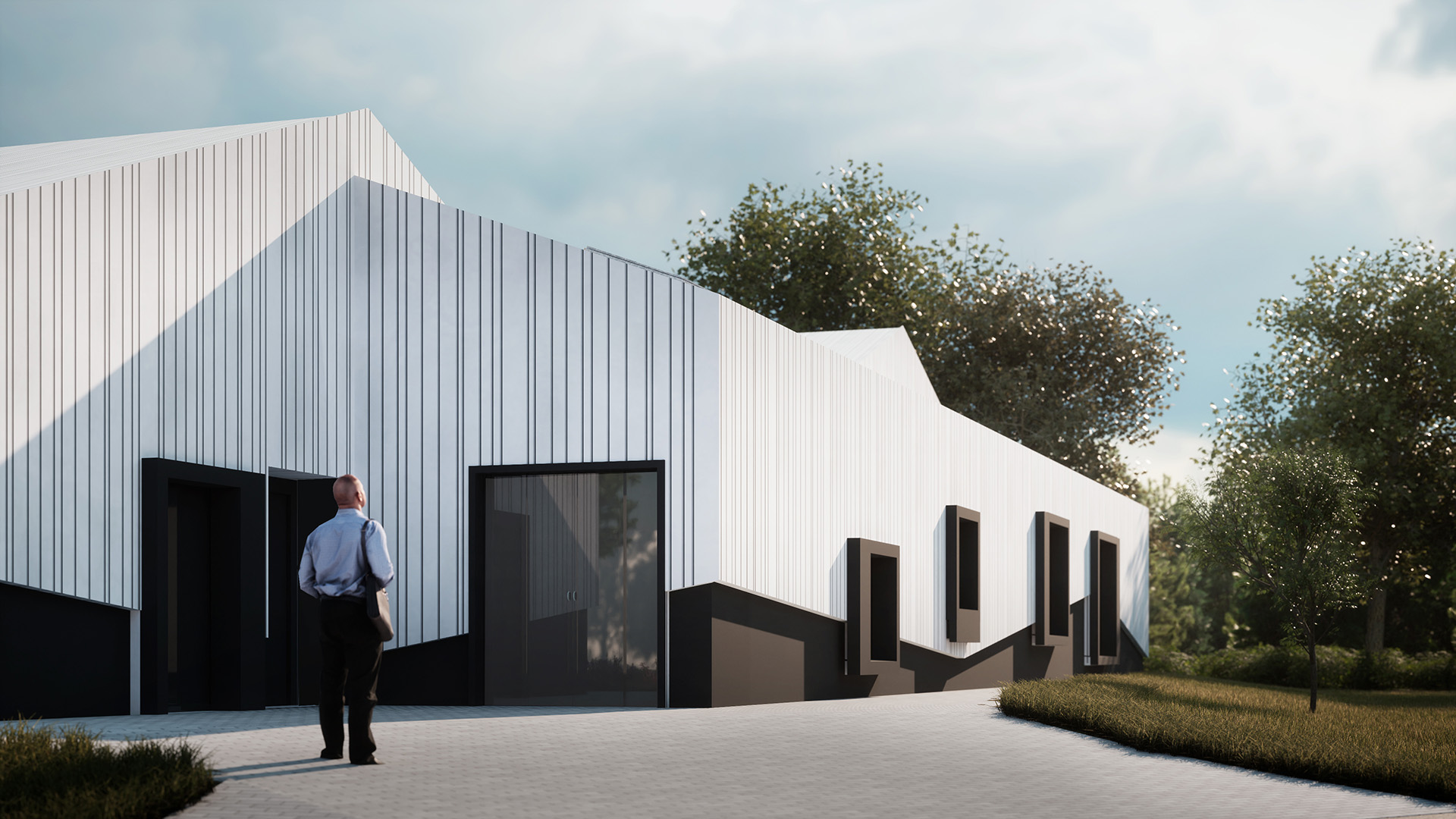
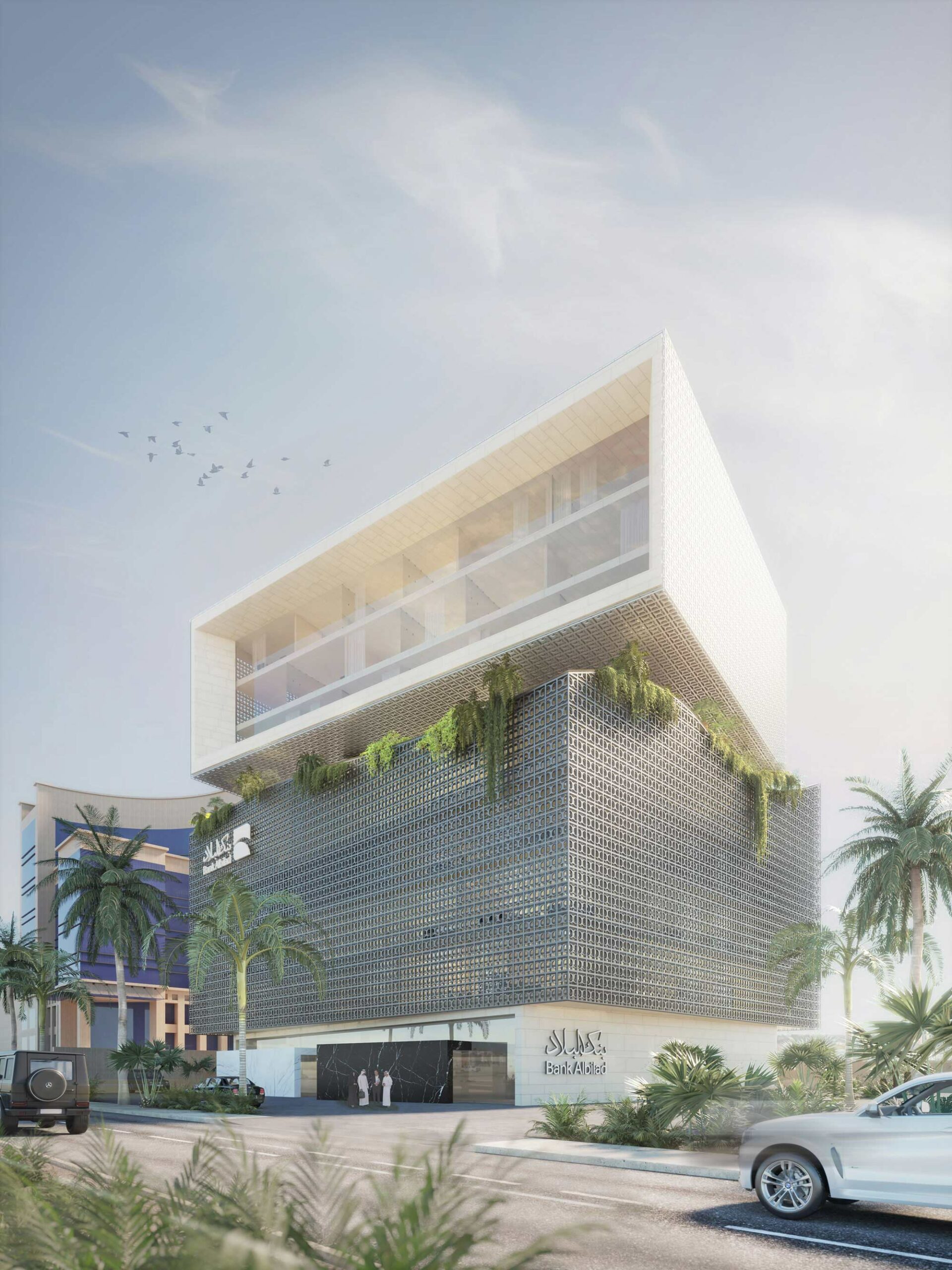
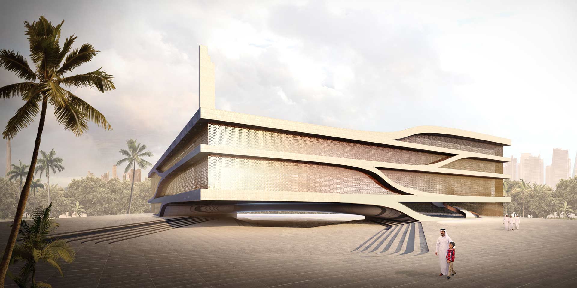
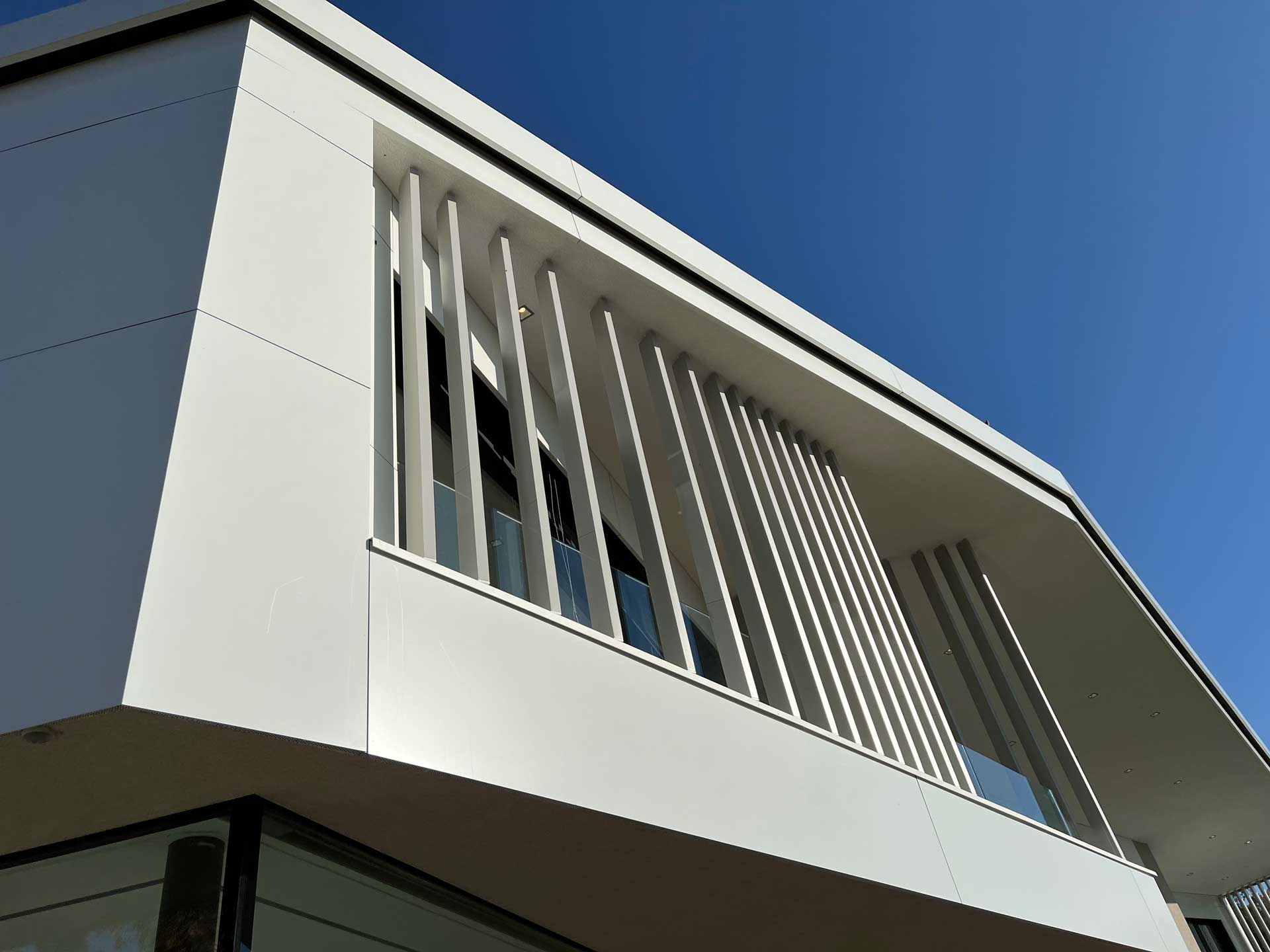
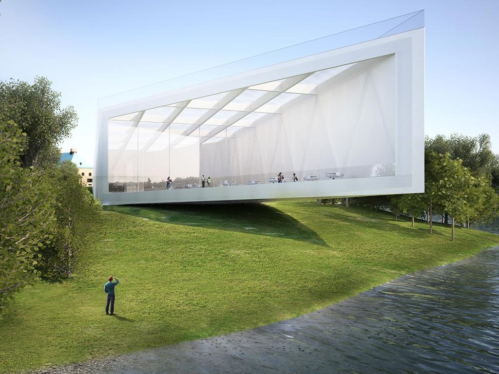
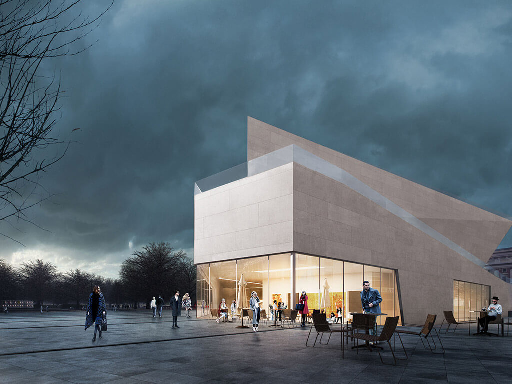
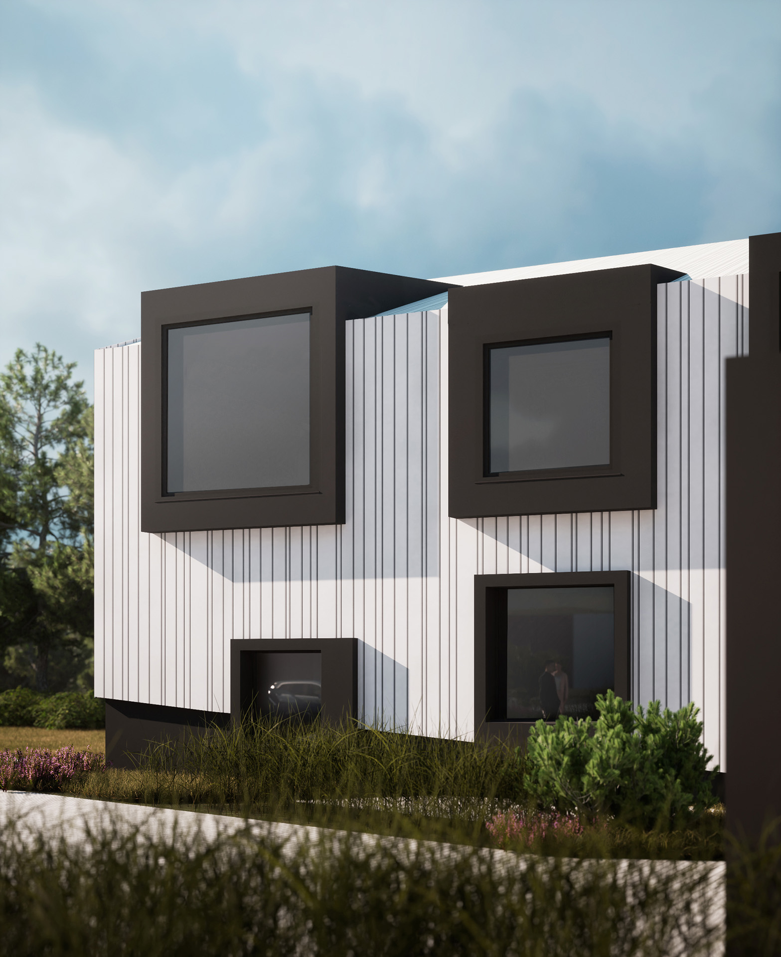
While the shape is completely inspired by the traditional form, we decided to keep the facade more “modern” and covered or “draped” the whole building with a metal skin. A facade which playfully swings above the ground, never completely touching it. With windows sometimes protruding with oversized, thick black frames through, and sometimes remaining completely hidden behind the perforated facade when necessary for the program.
Facts
SIZE: 2000m²
TYPOLOGY: Office
STATUS: In Progress
CLIENT: Steirerfleisch
PROJECT ARCHITECT: Andrea Vattovani
PROJECT TEAM DESIGN: Igor Kolonic, Imke Brandt
PROJECT TEAM IMPLEMETATION: Mario Keusch, Valentin Golger, Laurenz Neuhauser
3D RENDERINGS: AVA
CONSULTATNS:: PORR, HE house of engineering OG, Pilz & Partner Ziviltechniker GMBH, Spätauf GmbH, GDP, Trummer Planung
